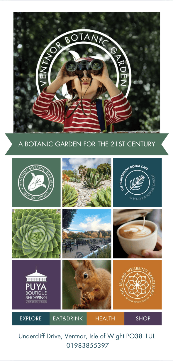
Ventnor Botanic Garden
Turned a 160-page content archive into a conversion system - online ticket purchases increased ~50%
Role: Principal Designer (solo), No-code Developer
Platforms: Web - responsive desktop & mobile
Skills: Product design, branding, Usability testing, Qualitative research, Web design
Problem
The website evolved without product ownership
160+ pages, duplicated content, no clear information architecture, and no visibility into conversion
Core issue:
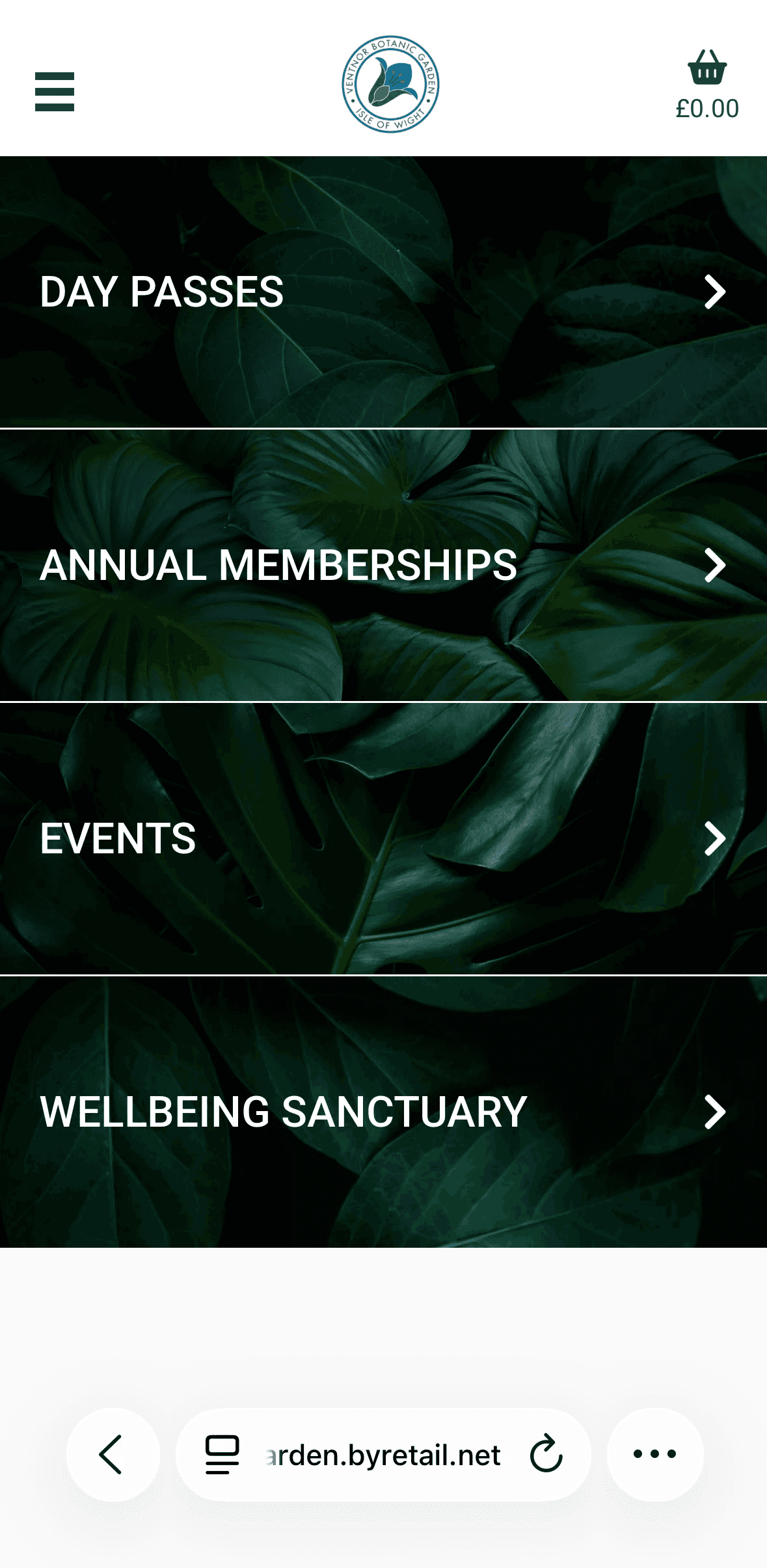
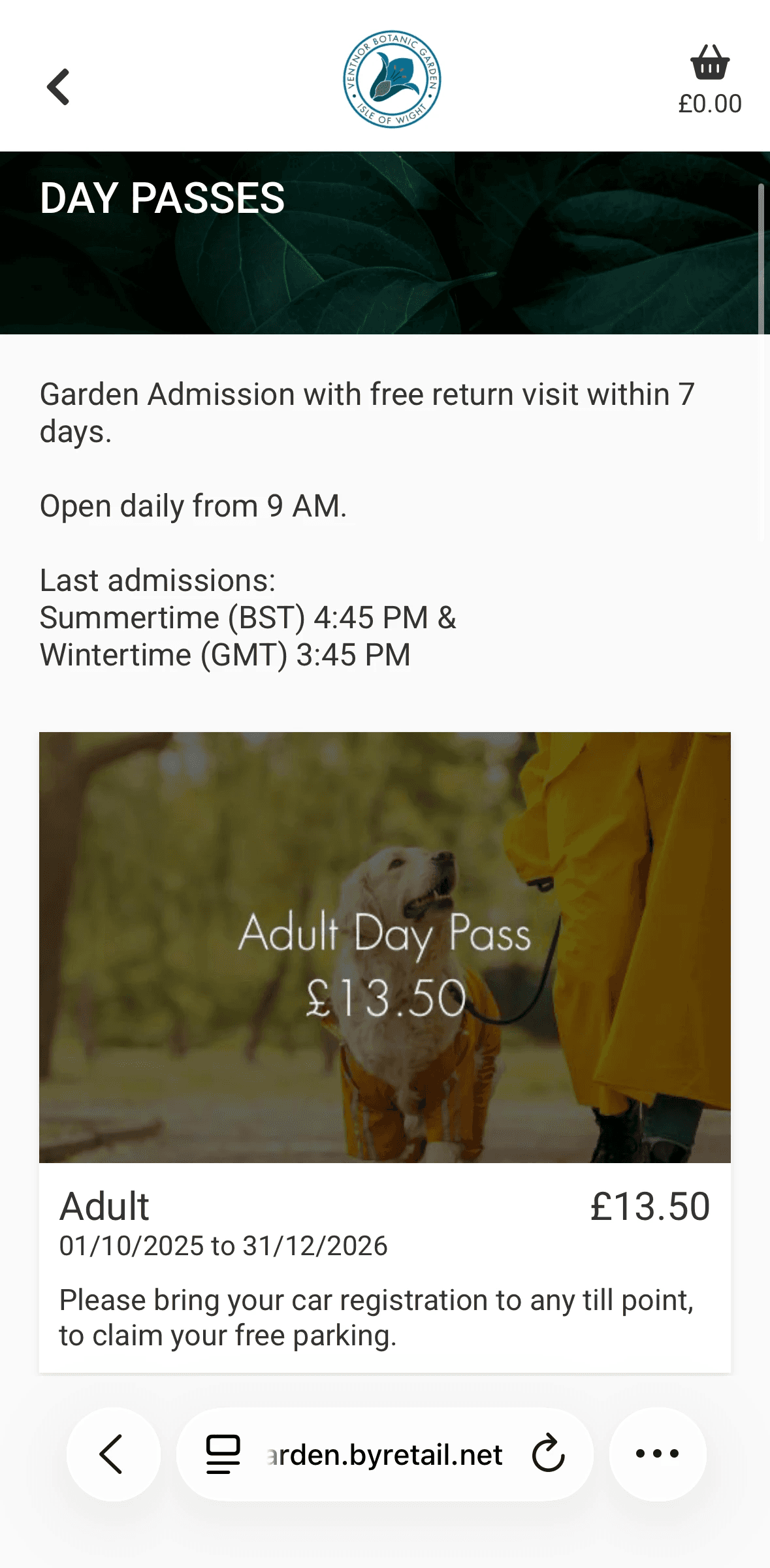
Users couldn’t easily complete the primary action - buying tickets
No mobile version at all
Actions
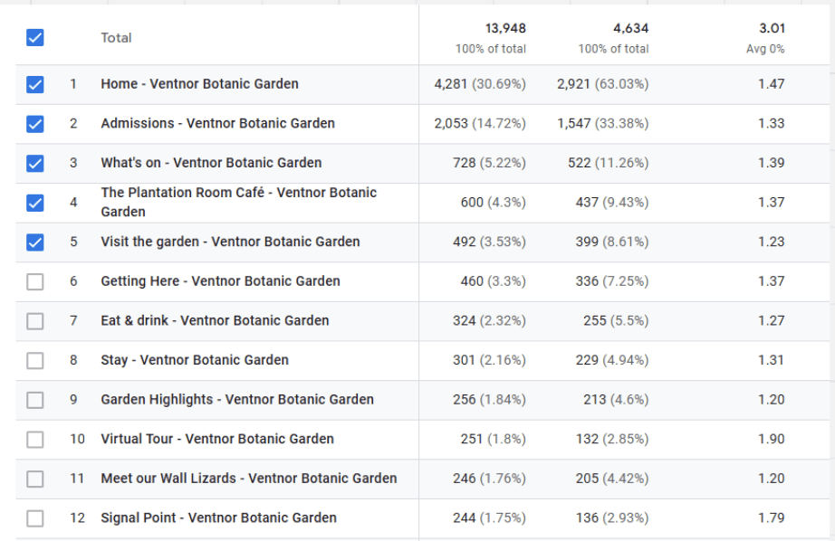
Reduced total pages from 160 → 38 based on Google Analytics
Archived 465 outdated articles
Rebuilt the Information Architecture around user intent and key actions
Reduced plugin dependency
Hard-coded custom components where needed
Implemented structured UTM tracking for campaign attribution
Standardised typography, colour palette, and layout logic
Unified digital and offline brand presence
Impact
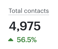
+~50% increase in online ticket purchases
+24% active users
+20% sessions
Pages reduced by 67%
465 outdated articles archived
Shift toward digital-first ticket sales
Mobile version is easy to use and allow you to do all core functionality
🧠 Problem

Ventnor Botanic Garden had a website that had grown without any product ownership. After years of adding pages, events, and articles without ever removing anything, it had ballooned to over 160 pages - with duplicated content, no clear structure, and no visibility into what was actually driving visits or ticket sales.
I started by aligning with the business on what success actually looked like - not just 'a better website' but specific, measurable goals.
From there I combined quantitative and qualitative research to understand where the experience was breaking down.
On the quantitative side, I mapped every page in Google Analytics against traffic and conversion data.
This told me what people were actually using and what was just noise.
On the qualitative side, I reviewed TripAdvisor and Google reviews for usability signals, and collected direct user feedback on the booking flow.
Rather than starting with a visual redesign, I focused on structural clarity first. My hypothesis was simple: users didn't need more content, they needed clearer paths to the actions that mattered. Visual improvements came later, and only where they directly supported usability.
Quantitative
Analysed Google Analytics to identify high-traffic but low-conversion pages
Mapped user journeys toward ticket purchase
Identified drop-offs and navigation confusion points
Benchmarked against similar garden websites
Qualitative
Reviewed TripAdvisor and Google reviews for usability issues
Collected direct user feedback on clarity and booking flow
Evaluated backend structure and plugin dependency
Key insight
Users came with clear intent:
Purchase tickets
Understand what’s available (disabled paths, cafe, open and closing times, etc.)
Check events
Overview about garden
The core issue became obvious: users were coming to the site with one of four clear goals - buy tickets, check what's on, understand facilities, or find opening times.
The site made all of these harder than they needed to be. The primary revenue action (buying a ticket) was buried, and the navigation created friction at every step.
There was also no mobile version at all, which meant a huge portion of users were getting a broken experience on the device they were most likely using.
🎨 Design

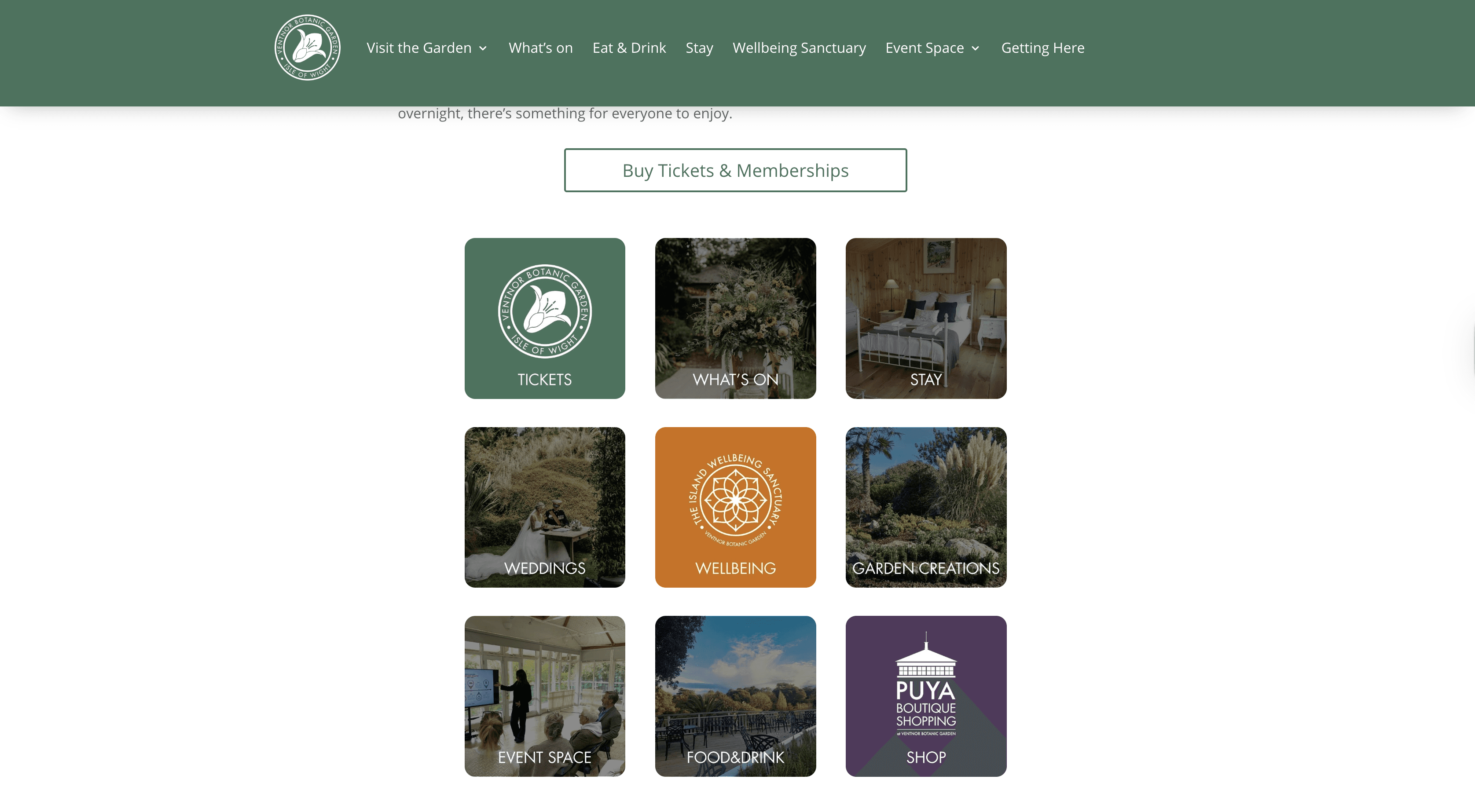
I reframed the website from an information archive into a conversion system
Key bets
Prioritise ticket purchase as the primary action
Surface “What’s on” to capture local intent and drive repeat visits
Reduce cognitive load through simplified structure and clear hierarchy
Introduce measurement to understand what drives conversions
Improve backend sustainability to support faster iteration
Rather than starting with a visual redesign, I focused on structural clarity and measurable outcomes.
Visual improvements were made progressively where they supported usability, but the primary goal was to reduce friction and make key actions obvious.
Focused on high-impact changes first to validate direction before investing in deeper polish.
🔧 Execution & Constraints

Worked within strict visual direction from stakeholders (Colors, typography) and technical restrictions from wordpress
Built custom components with no-code tools to avoid plugin dependency and reduce costs
Implemented solutions directly instead of design-dev handoff as I didn't have a developer
I was testing various things on a way, like this:
Hypothesis
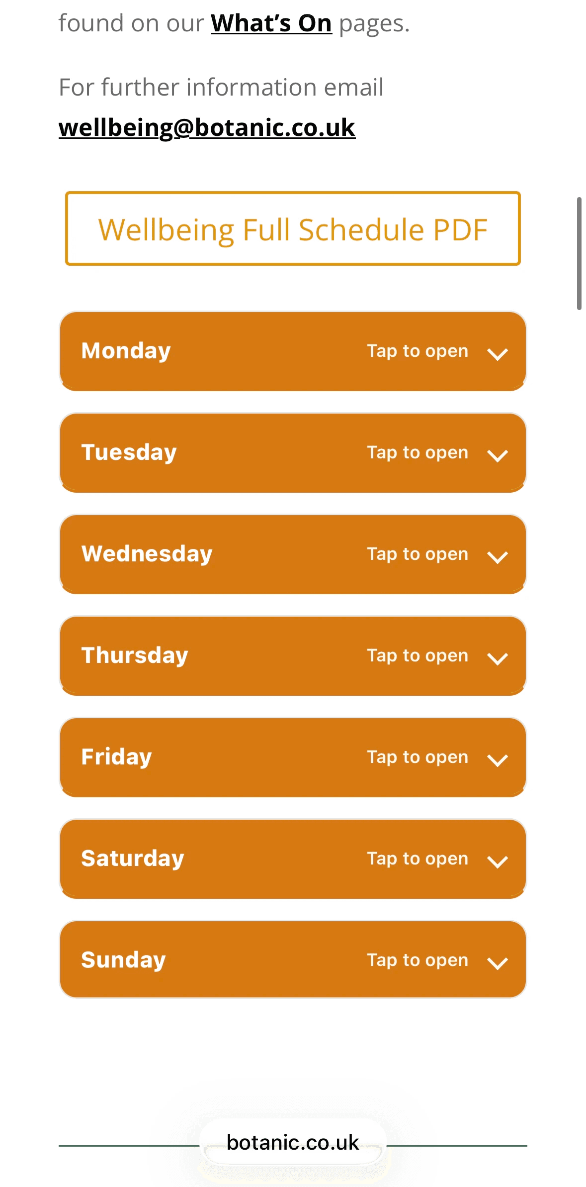
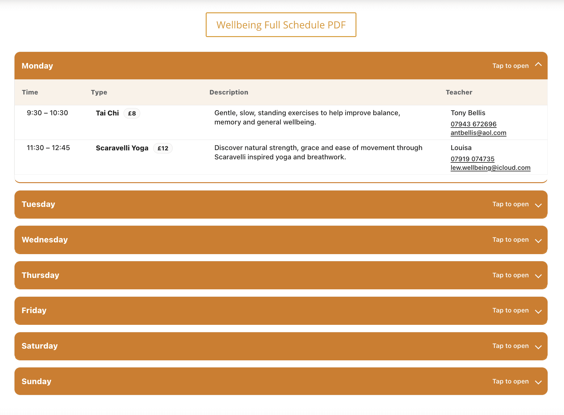
Mobile users struggled to access and navigate the event schedule efficiently.
Experiment
Introduced a downloadable full schedule (PDF) as a quick-access alternative
Outcome
They weren't struggling, but people liked that they can save schedule on their phone
Learning
In some cases outcome can be what you haven't even thought about
Or other example - I ran a quick usability test with older visitors, a core demographic to check that all is clear and they can do core actions through the phone
✨ Results


+~50% increase in online ticket purchases
+24% active users
+20% sessions
−33% engagement time (users completed tasks faster due to reduced cognitive load)
Behavioural impact
Workshops and wellbeing classes that had previously been under-attended started reaching full capacity after the 'What's On' and "wellbeing" section was surfaced properly.
The shift toward online ticket purchases also reduced the admin burden on the team significantly.
Beyond the numbers: the garden now has a website that reflects what it actually is - a serious, well-run cultural venue, rather than a chaotic digital archive.
Interpretation
Reducing friction had a greater impact than adding new features.
Users didn’t need more content - they needed clearer paths to action and layout.